The following tool can display, animate, and graph sea ice and snow thickness data. A date range and stations can be selected, which automatically updates the map and graph. Whether the data is displayed as monthly or weekly averages, or as-collected (raw) can also be selected. Selected data can be viewed in the Table tab and downloaded by clicking the button at the bottom of the visualization. Graphs from the Graph tab can also be downloaded in PDF and PNG format. The display language can be switched from French to English at any time by clicking the button near the top right.
To begin the animation on the Map tab, click the play button on the bottom right. The stations will begin animating, changing height to denote ice and snow thickness over time. At any time, a station can be clicked to show the precise reading at the date indicated on the bottom right.
The data used has been collected under the Canadian Ice Thickness Program from Environment and Climate Change Canada. The data consists of approximately weekly measurements of ice and snow thickness over the course of a winter season from 2002 to 2023. Measurements end when the ice is no longer safe to walk on.
The quantity of multiyear ice has been decreasing within the Arctic in recent decades. The following video displays the retreat of multiyear ice from 1987 to 2012.
Loss of Multi-year Sea Ice Video from NOAA Climate on YouTube.
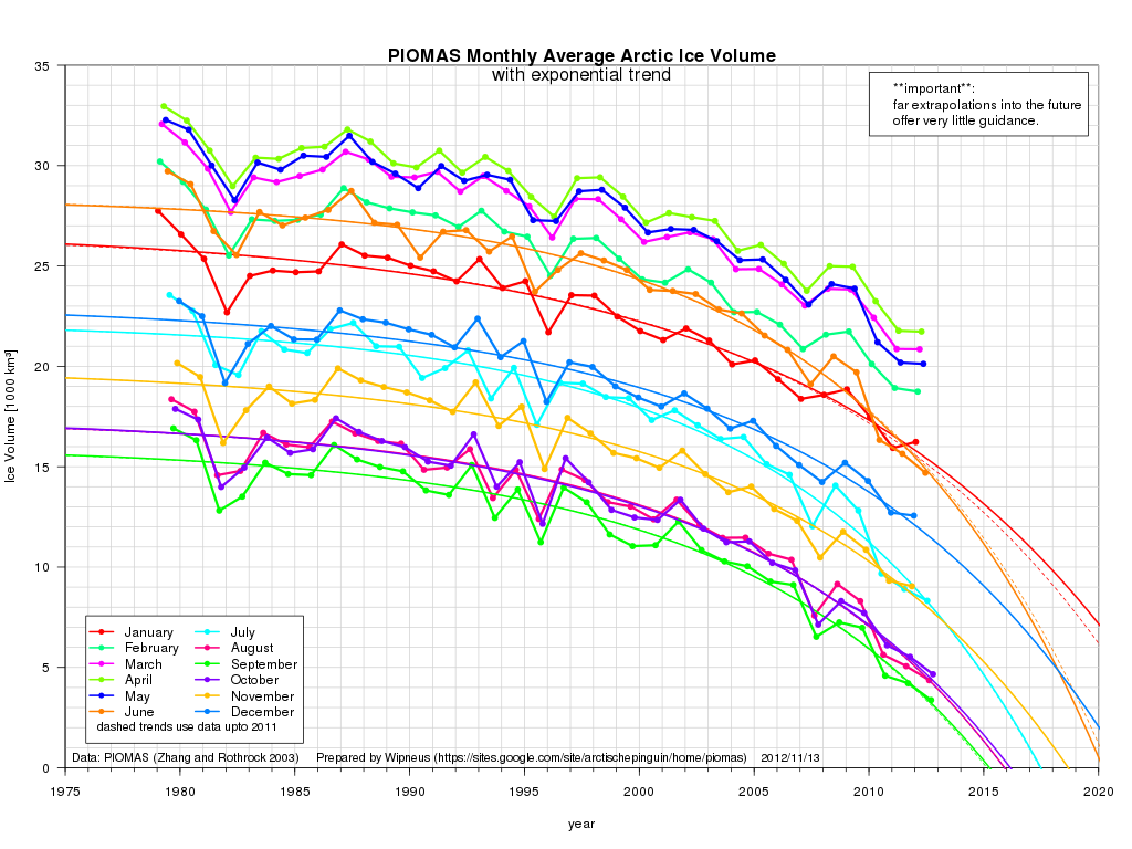
Figure 1: Monthly average Arctic ice volume change during all months of the year with expolation trends extended until 2020 (PIOMAS, 2013)
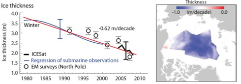
Figure 2: Ice thickness trend from 1980 to present from ICESat data, submarine observations and EM North Pole surveys (IPCC, 2013)
Material on this page was provided by Maren Pauly and Tristan Mills, Department of Geography, University of Waterloo.